
Using <picture> <source> and <img> HTML5 elements combined with the media, srcset, and size attributes, it is possible and even necessary to make responsive images for your users. Doing so will minimize the size of your images, make it your site load faster, and therefore create a better UX. There are two approaches. To decide, ask:
Q: Do I want to take into account device orientation and/or screen resolution?
Answer 1: ‘No.’
Thats cool. This approach is simpler, which makes sense. It is for a simpler use-case. Heres an example of an HTML5 responsive <img /> element.
/* CSS */
@media only screen and (max-width: 799px) {
  img {
    width: 50%;
  }
}

@media only screen and (min-width: 800px) and (max-width: 1419px) {
  img {
    width: 75%;
  }
}

@media only screen and (min-width: 1240px) {
  img {
    width: 100%;
  }
}
<!-- HTML -->
<img sizes="(min-width: 1240px) 100vw,
(min-width: 800px) 75vw,
(min-width: 0px) 50vw"
srcset="http://brendan-quinn.xyz/css/images/responsive-images-portrait-sm-2x.jpg 200w,
http://brendan-quinn.xyz/css/images/responsive-images-portrait-sm-2x.jpg 400w,
http://brendan-quinn.xyz/css/images/responsive-images-portrait-md.jpg 528w,
http://brendan-quinn.xyz/css/images/responsive-images-portrait-lg.jpg 1000w,
http://brendan-quinn.xyz/css/images/responsive-images-portrait-md-2x.jpg 1046w,
http://brendan-quinn.xyz/css/images/responsive-images-portrait-lg-1.5x.jpg 1500w,
http://brendan-quinn.xyz/css/images/responsive-images-portrait-lg-2x.jpg 2000w"
src="http://brendan-quinn.xyz/css/images/responsive-images-portrait-sm.jpg"
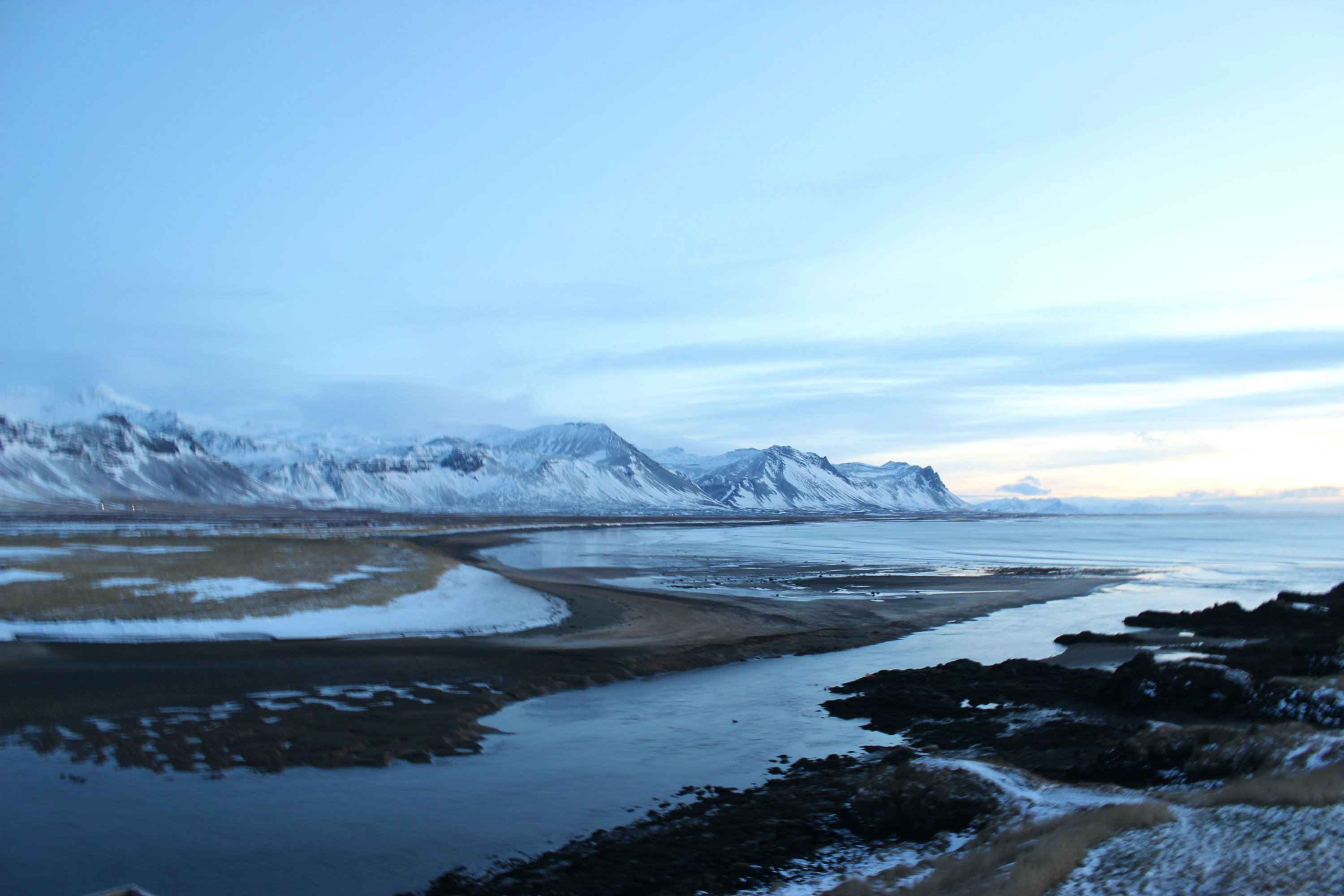
alt="Icelandic Landscape View" />
Sizes takes a inequality using min-width or max-width and the size of the image at each viewport size. (min-width: 800px) 75vw, coincide with the css width of the image: @media only screen and (min-width: 800px) and (max-width: 1419px) { img {width: 75%;} }. This helps the browser calculate the size of the image that it can then search through srcset and find the appropriate image. If, for example, a user were browsing on a device which had a viewport size of 910px, the second media statement would be satisfied. It would then calculate 910 * .75 = 675, and look for the appropriate image in srcset.
Srcset contains a comma delimited list of identical images of different scale and their width. for example, http://brendan-quinn.xyz/css/images/responsive-images-portrait-md-2x.jpg 1046w, tells us that image responsive-images-portrait-md-2x.jpg is 1046px wide. The best image for the use-case given of a viewport of width 910px and therefore and image width of 675px would then be http://brendan-quinn.xyz/css/images/responsive-images-portrait-lg.jpg 1000w, since it is the smallest image that will not distort to fit the space.
Here it is live:
See the Pen Responsive HTML5 Image Element by Brendan Quinn (@Mathdrquinn) on CodePen.
Answer 2: ‘Yes. Resolution and orientation are important.’
Double Cool. This approach introduces two additional elements: picture and source. Here’s the structure:
<picture>
  <source srcset="<!-- url for a device pixel ratio of 1 --> 1x,
      <!-- url for a device pixel ratio of 1.5 --> 1.5x,
      <!-- url for a device pixel ratio of 2 --> 2x"
    media="<!-- Media conditions here-->" />
  <source srcset="<!-- url for a device pixel ratio of 1 --> 1x,
      <!-- url for a device pixel ratio of 1.5 --> 1.5x,
      <!-- url for a device pixel ratio of 2 --> 2x"
    media="-- Media conditions here--" />
  <img src="<!-- default url -->" alt="" />
</picture>
Similar to both answer 1 and a switch statement, the browser will load the first source whose media condition evaluates to true with the correct url to match the pixel ratio of the device.
Because media is separated out into its own attribute, we have available to us all of the options we would in CSS. Here is a more flushed out example with media queries that consider orientation.
<picture>
<source srcset="http://brendan-quinn.xyz/css/images/responsive-images-landscape-lg.jpg 1x,
http://brendan-quinn.xyz/css/images/responsive-images-landscape-lg-1.5x.jpg 1.5x,
http://brendan-quinn.xyz/css/images/responsive-images-landscape-lg-2x.jpg 2x"
media="only screen and (min-width: 1240px)">
<source srcset="http://brendan-quinn.xyz/css/images/responsive-images-landscape-md.jpg 1x,
http://brendan-quinn.xyz/css/images/responsive-images-landscape-md-1.5x.jpg 1.5x,
http://brendan-quinn.xyz/css/images/responsive-images-landscape-md-2x.jpg 2x"
media="only screen and (min-width: 800px)">
<source srcset="http://brendan-quinn.xyz/css/images/responsive-images-landscape-sm.jpg 1x,
http://brendan-quinn.xyz/css/images/responsive-images-landscape-sm-1.5x.jpg 1.5x,
http://brendan-quinn.xyz/css/images/responsive-images-landscape-sm-2x.jpg 2x"
media="only screen and (min-width: 0px) and (orientation: landscape)">
<source srcset="http://brendan-quinn.xyz/css/images/responsive-images-portrait-sm.jpg 1x,
http://brendan-quinn.xyz/css/images/responsive-images-portrait-sm-1.5x.jpg 1.5x,
http://brendan-quinn.xyz/css/images/responsive-images-portrait-sm-2x.jpg 2x"
media="all and (min-width: 0px) and (orientation: portrait)">
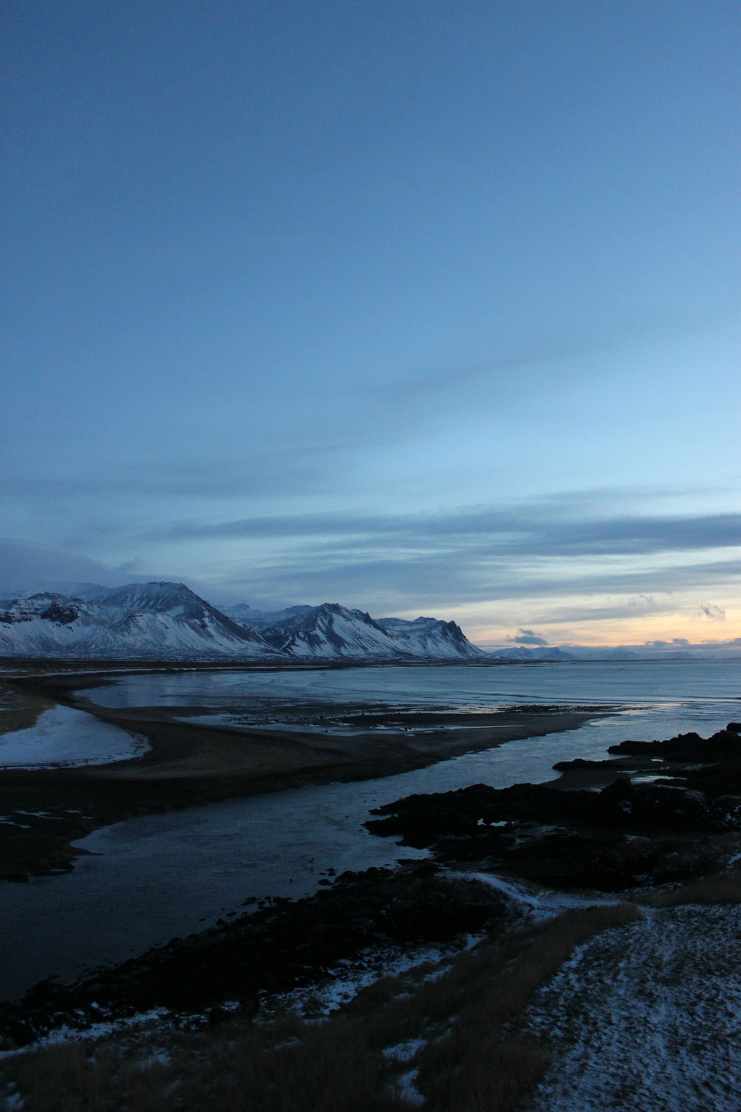
<img src="http://brendan-quinn.xyz/css/images/responsive-images-landscape-sm-2x.jpg" alt="Icelandic Landscape" />
</picture>
Live:
See the Pen Responsive HTML5 Images by Brendan Quinn (@Mathdrquinn) on CodePen.
While I enjoy the flexibility of this method, it is verbose, and while orientation changing works well on my desktop, I’m having issue getting orientation to work on mobile. I’m still looking for a solution and will add the details if I find an answer.
As always, if you’re looking for much more detail on these elements and attributes, visit the W3C specifications and pour over them. While this post just skims the topic of responsive images, it would have been a poor one had I not consulted it.
All the Best,
Brendan